Project ObjectiveMore Than addresses gendered ageism by fostering intergenerational connections through creative workshops, empowering women to share, learn, and grow together.
1/4Challenge
ClientMore Than
Winning entry for internship at Accept and ProceedCategory Brand Identity, Visual Identity
Gendered ageism continues to affect women across all stages of life-limiting professional opportunities, impacting health, and diminishing emotional well-being.
More Than tackles this challenge by fostering intergenerational connections through creative workshops. These workshops are designed for women of all ages and abilities, providing a welcoming space where participants can learn new skills, share experiences, and build meaningful relationships.
By encouraging conversations across generations, More Than helps reshape the narrative around ageing and empowers women to support each other.
-
One way to challenge this is through intergenerational conversations, which create space for empathy, understanding, and shared experience.
Primary Logo
Secondary Logo
2/4Art Direction
How did I develop the brand?The logo was designed to be dynamic and expressive, built as a combination mark that pairs a heart-shaped visual element with the letter ‘m’-blending word and image into one unified symbol.
The colour palette takes inspiration from Warning by Jenny Joseph, a poem that subtly challenged the social expectations placed on women in the 1960s. The pairing of purple and red reflects this progressive spirit, representing bold self-expression and the generational connection among women.
-
Aria Text was chosen for its elegance and adaptability, with its balanced stroke contrast making it suitable for both large-scale and small-format applications.
An abstract face pattern also plays a central role in the brand’s identity. Its continuous line work symbolises intergenerational connection, while the heart-shaped lips-mirroring the logo-add a sense of warmth and affection, reinforcing the inclusive and empowering message behind the brand.
IllustrationsPattern


3/4User Journey
Defining the relevant touchpointsWith a wide age range across the target audience, I defined three core user types: a young woman, a middle-aged woman, and a retired woman. Mapping out each of their journeys helped reveal key moments of overlap. These shared touchpoints became the foundation for creating a cohesive brand experience that resonates across generations.
-
The user journeys intersect at several key stages: engaging with the website, receiving the event invite, attending the workshop, and finally, becoming More Than members.
These moments of overlap demonstrate how the brand succeeds in creating intergenerational connection.

4/4Brand Applications
How is the brand expressed?The website was designed to be clear, accessible, and informative- ensuring users of all ages can easily navigate and find what they need. Ink-style illustrations bring warmth and authenticity to the experience, while testimonials reinforce the brand’s credibility and long-term purpose.
The printed invite was a key design decision, acting as the first physical touchpoint for each user and marking their entry into the workshop experience.
-
Reviews on the site highlight real user experiences, positioning the community at the heart of the brand.
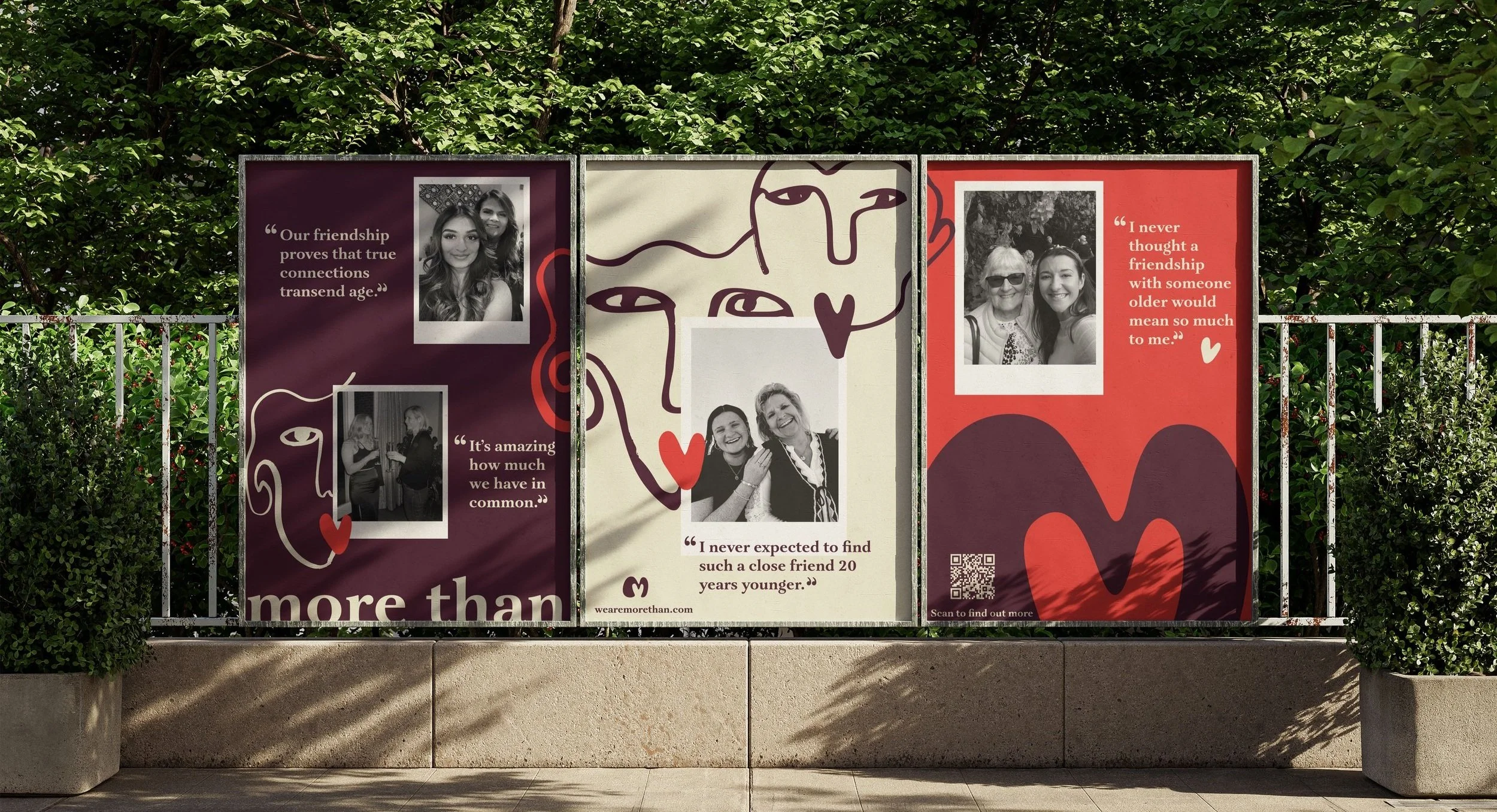
Posters use emotive storytelling, combining quotes from More Than members with imagery that celebrates intergenerational connection.
On social media, the brand maintains regular engagement by sharing upcoming events and behind-the-scenes content, extending the sense of connection and community across platforms.

